Metrotech
Type Design
An original typeface with multiple weights
This is some text inside of a div block.
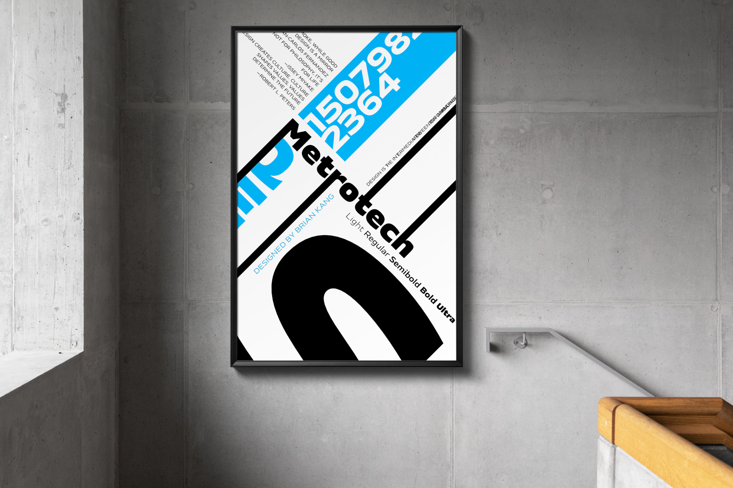
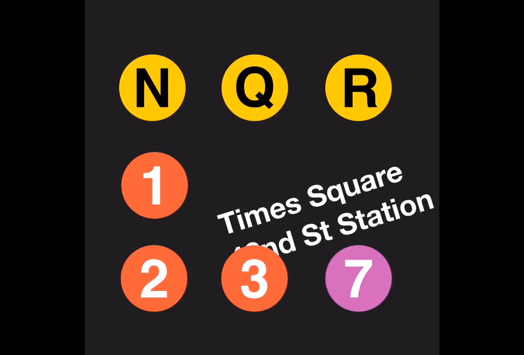
The name of this typeface, Metrotech, has several meanings. First, it’s a homage to the place where I spent the bulk of my time designing it—Metrotech Center in downtown Brooklyn. Second, it’s a reflection of the spirit of the typeface. Metrotech expresses the urban culture of a city like New York; confident and high-standing, with an understated, rather than overt sophistication. The “tech” in the name reflects its subtle but unabashed digital flair—the squared rectangle motif, vertical terminals, and spacious counters are reminiscent of sci-fi films and early computer terminals. The result is a font that feels “retro-futuristic”—equally effective in a sci-fi video game as in a retro style coding terminal.
Art With Code
Next Project
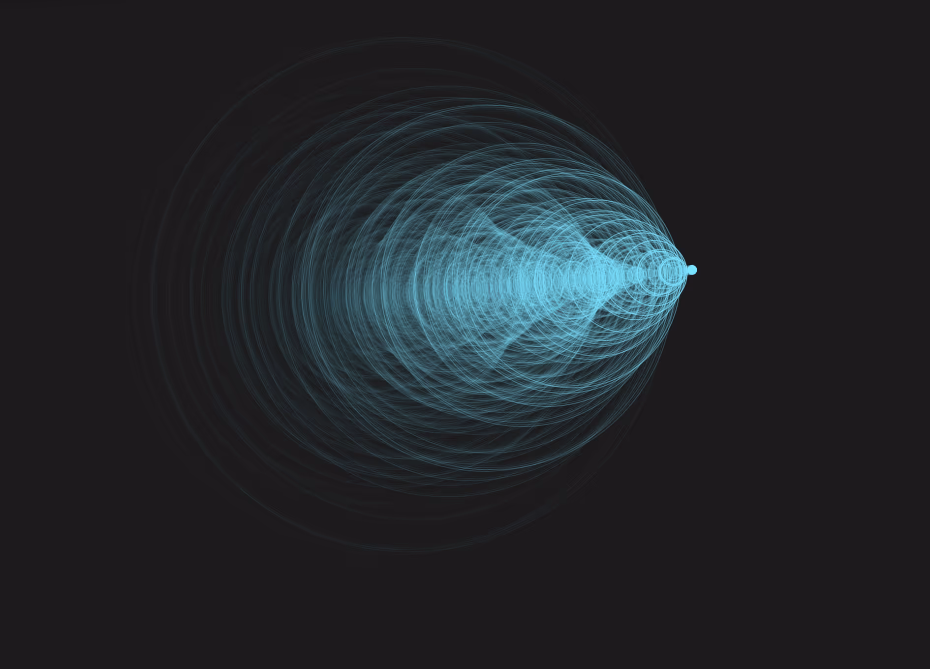
Water Waves
A simulation of wave patterns on water
This is some text inside of a div block.
Art With Code
Next Project
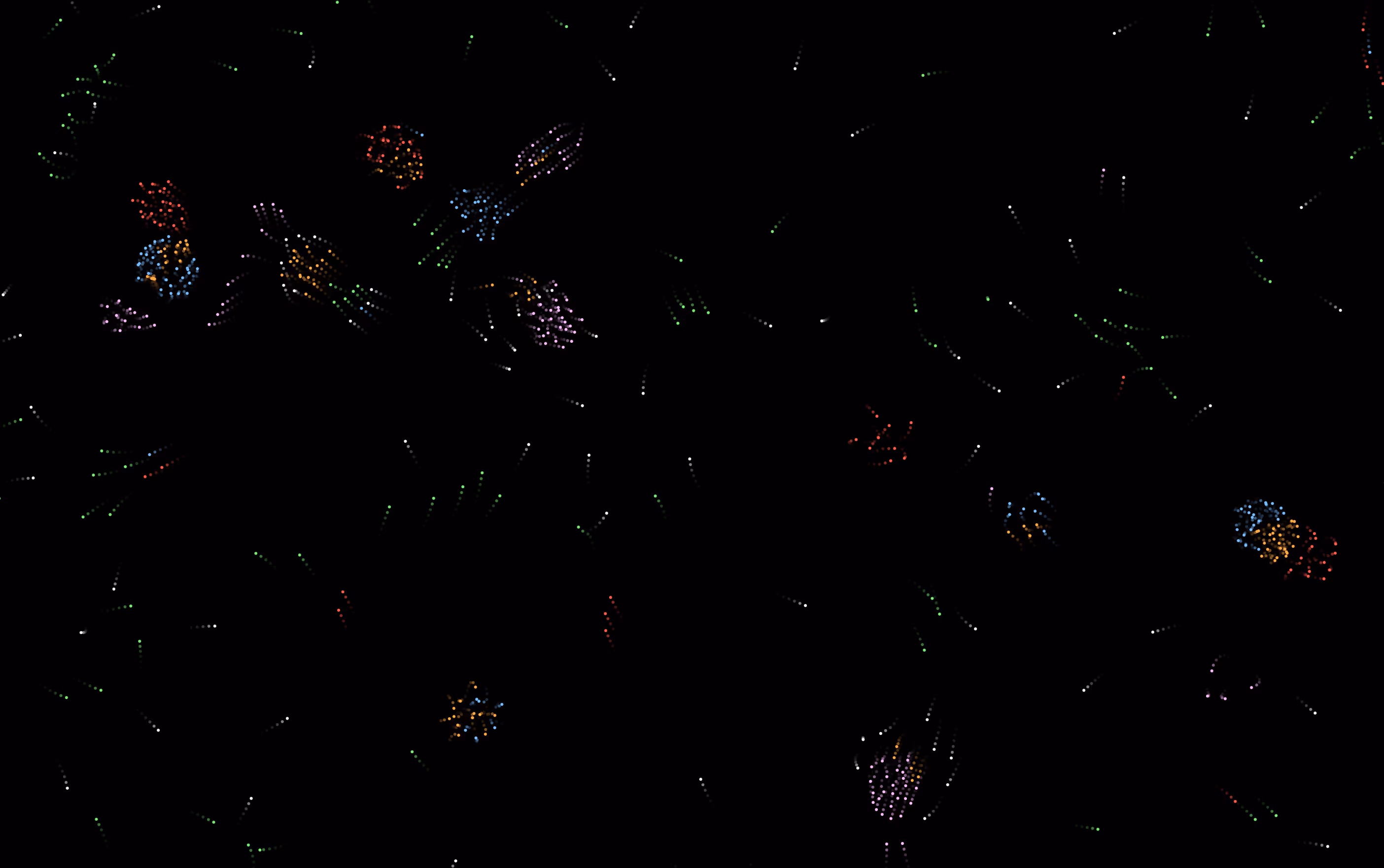
Particle Life
p5 JS simulation of organic phenomena
This is some text inside of a div block.
Branding
Next Project
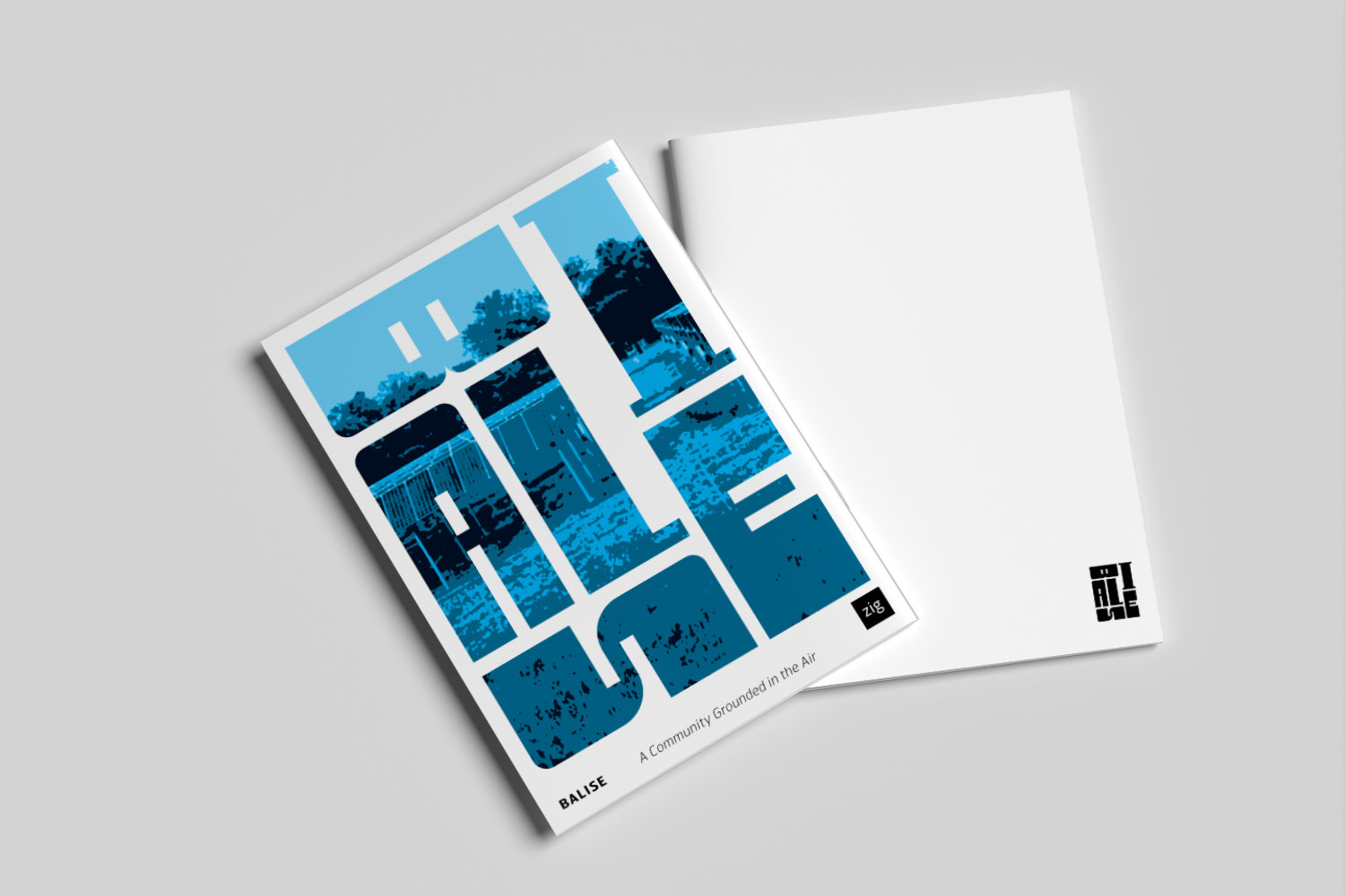
Balise
Editorial for a real estate development
This is some text inside of a div block.