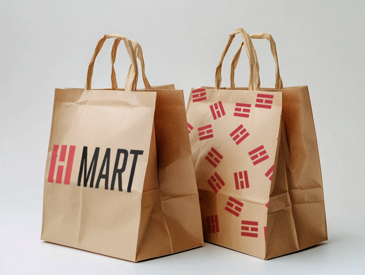
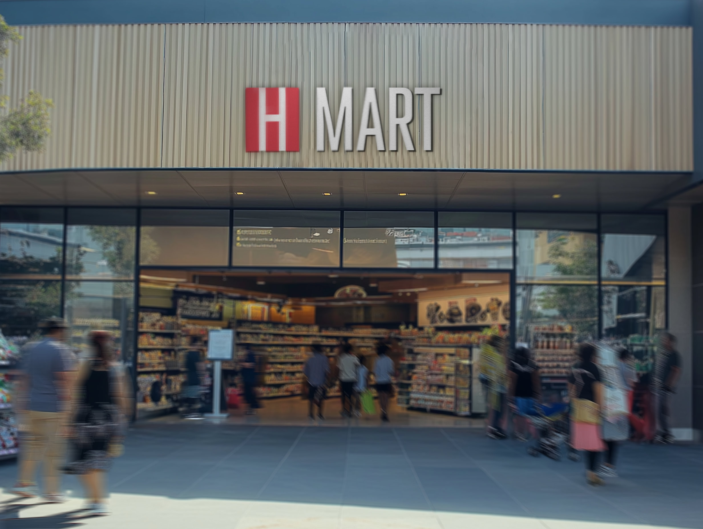
H Mart

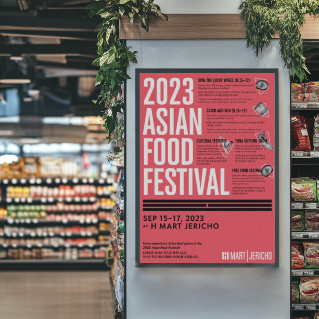
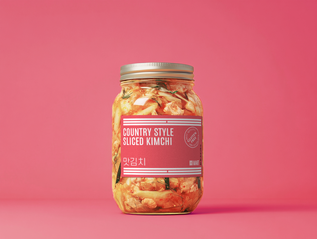
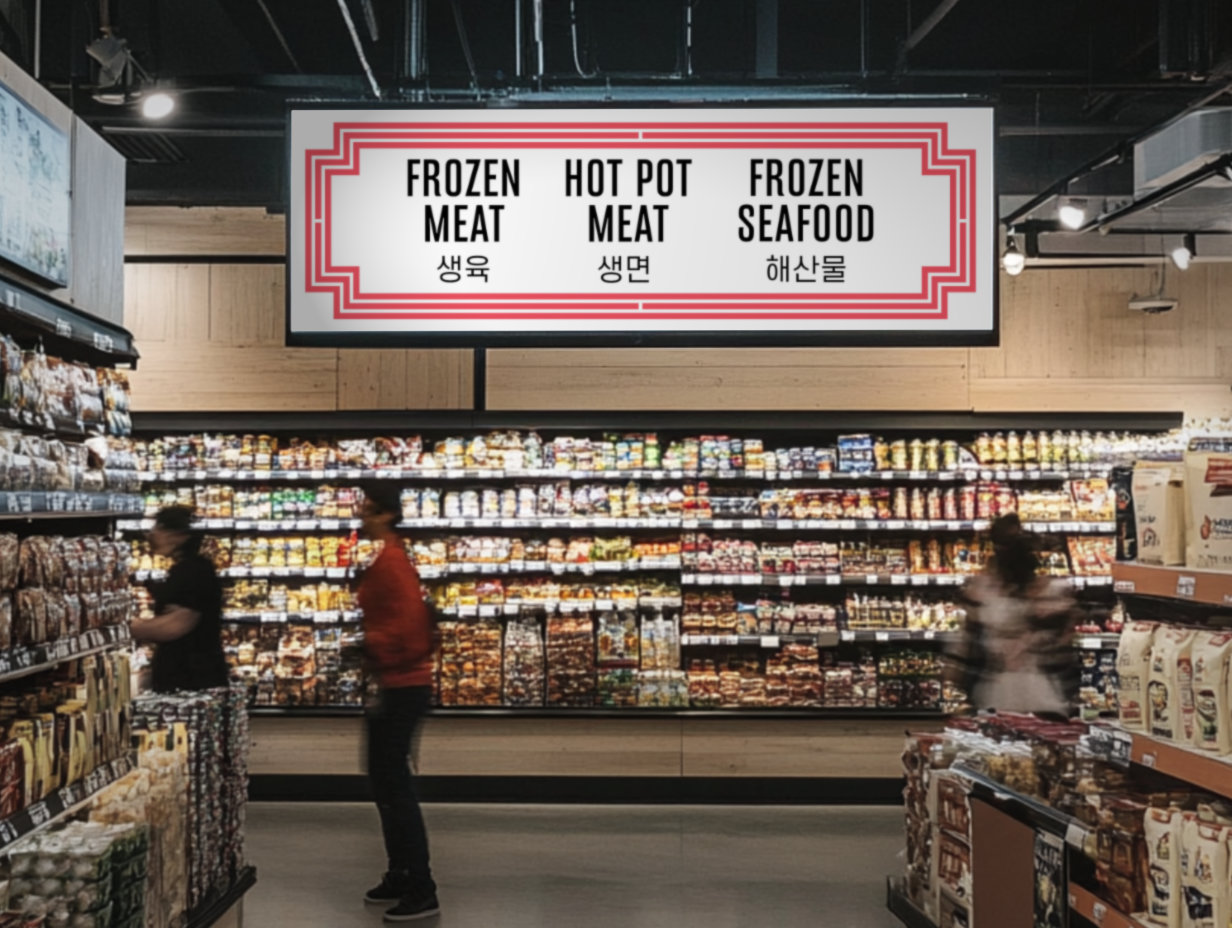
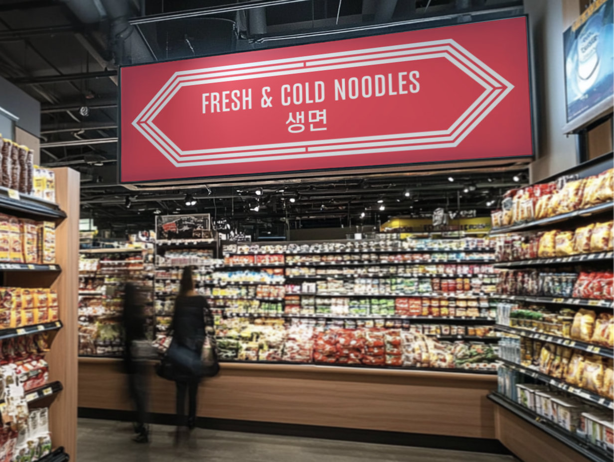
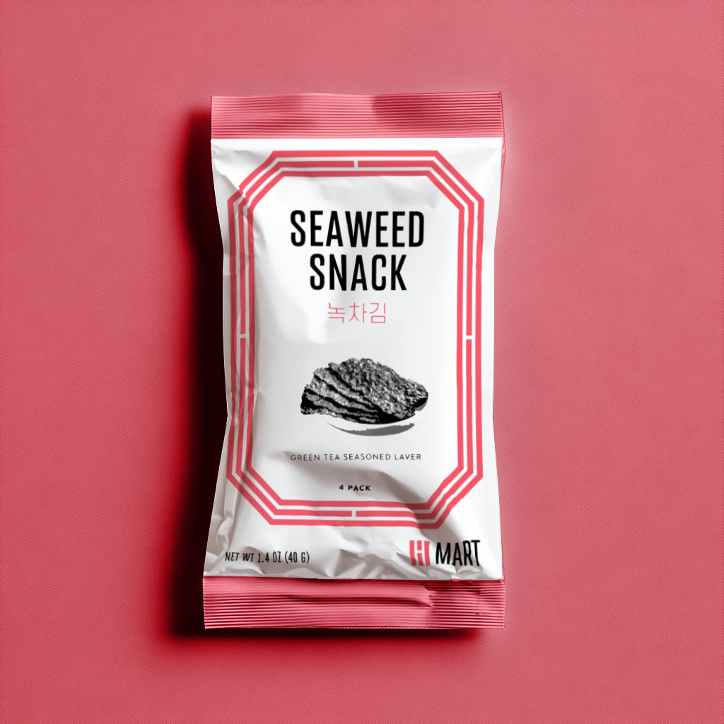
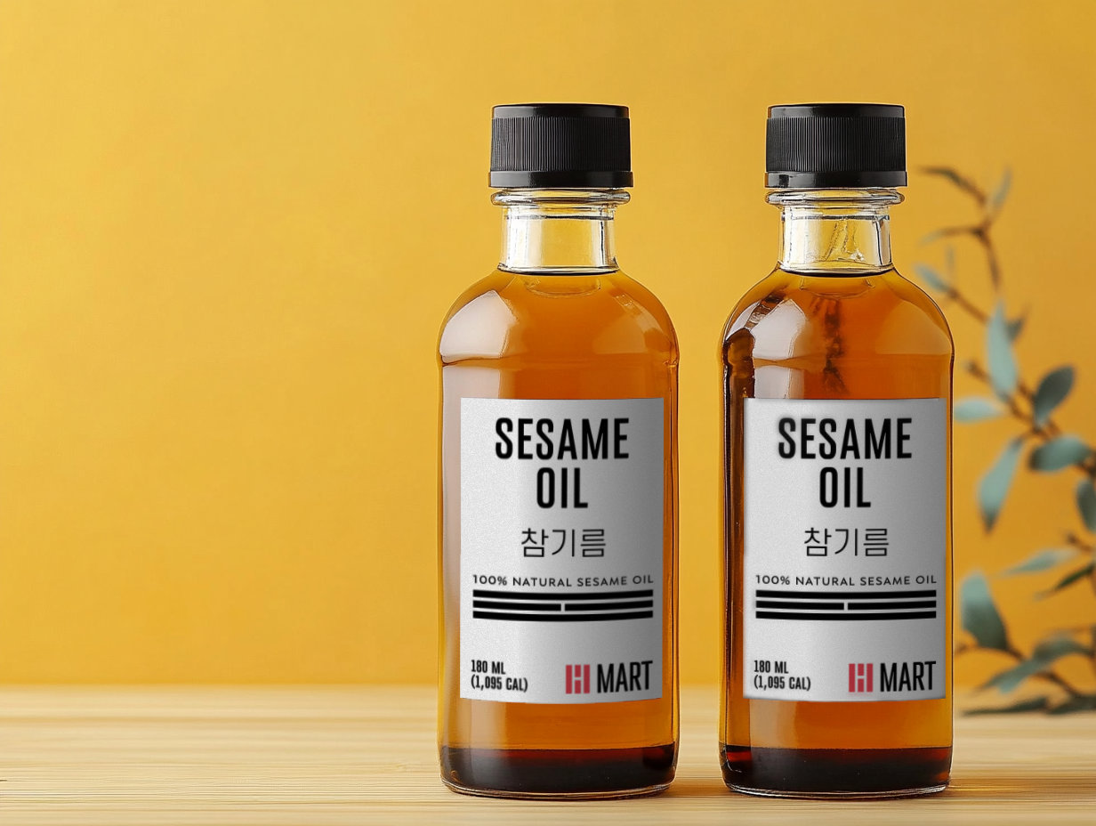
H Mart has become the most recognizable grocery chain for Korean groceries in the US. It has not only become an important facet of life for Koreans and asians living in the US, but introduces asian food products to non-asian consumers who are increasingly interested in Korean cuisine. I imagined a new logo and visual identity inspired by the symbols on the Korean flag. The logo forms an “H” within its negative space. This visual motif is extended to create graphic elements resembling patterns found on windows and doorframes in traditional Asian architecture. This versatile graphic system can be used on a variety of brand touchpoints, like packaging, wayfinding, and advertisements, making a dynamic brand that reflects both its Asian heritage and its place in the modern consumer market.


Water Waves

Particle Life

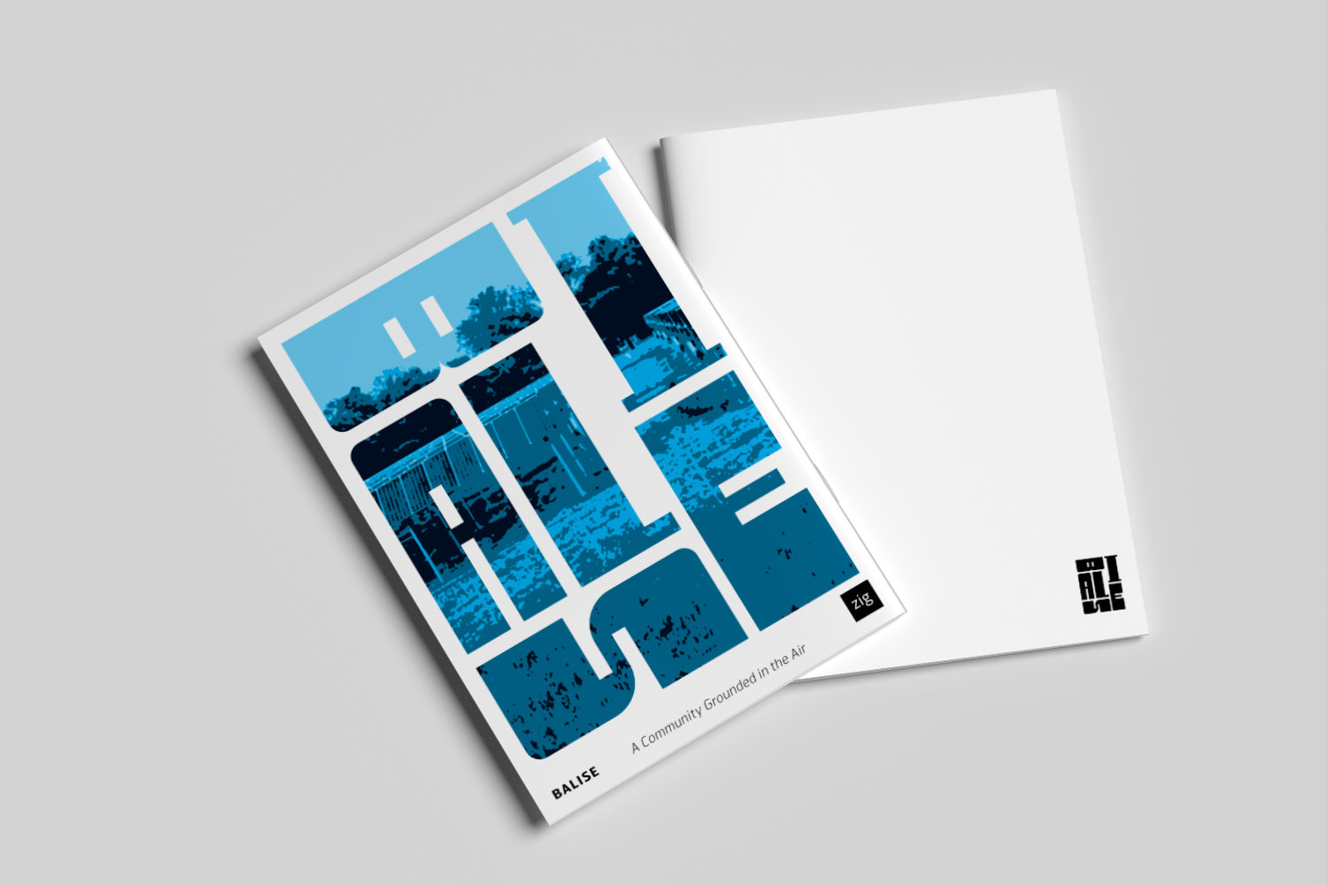
Balise